Open any Figma file. Look at those perfectly smooth corners, the glass blur with real depth, the stroke that sits cleanly inside the element without touching the spacing.
Now build it in CSS.
It’s close. But something is always slightly off. The corners feel harder. The blur is flat. The border is eating into your padding.
You’ve probably blamed yourself: wrong tool version, wrong browser, not enough CSS tricks. The real reason is simpler: Figma and your browser are two different rendering engines running different math. Some things Figma draws don’t exist in CSS yet. Some things look the same but work differently under the hood.
This post breaks down how each engine works, where they diverge, and what that means for every design-to-code handoff.
How Chrome turns CSS into pixels
When you write CSS and open it in Chrome, six things happen in sequence for every frame and every element.
1. Parse
Chrome reads your HTML and builds the DOM (a tree of every element). In parallel it reads CSS and builds the CSSOM (a tree of every style rule). Those two trees are combined into the render tree.
2. Style
Chrome walks every element and decides which CSS rules apply. It resolves specificity, inheritance, and the cascade. Every node ends up with computed styles; each property has an exact value.
3. Layout
Chrome figures out where each element sits and how much space it needs. This step is expensive. Change one width and Chrome may recalculate layout for a large subtree. That’s what people mean by reflow, and why it hurts performance.
4. Paint
Chrome records drawing instructions, not pixels yet: things like “fill this rectangle,” “draw this text run.” Order follows the CSS painting spec.
5. Composite
The page is split into layers and sent to the GPU. The GPU composites layers into the bitmap you see. Properties like transform and opacity can often skip heavy work earlier in the pipeline. That’s why they’re cheap to animate.
The crucial idea: every CSS property is implemented with math (fixed by web standards) (W3C / CSS WG). You write
border-radius: 40px, and you get a circular arc, because the spec says so. You writebackdrop-filter: blur(10px), and you get a Gaussian blur on the spec’s terms. You can’t extend that math from your stylesheet; browsers implement one interoperable definition.
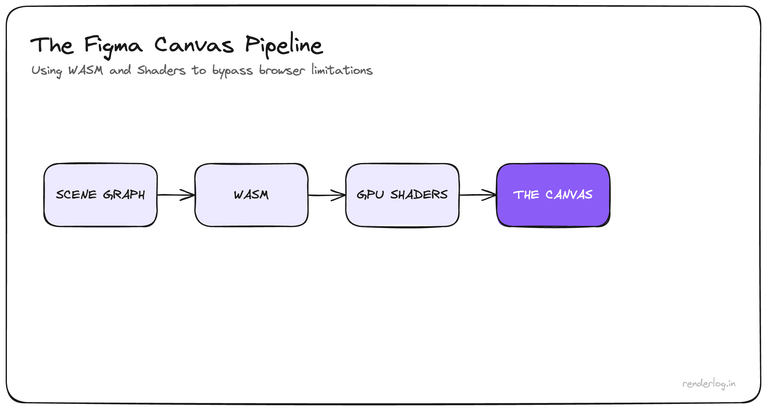
How Figma draws outside the DOM
Figma made a different bet when it launched in 2015: the canvas is not HTML and CSS.
C++ / Rust core
Figma maintains its own document model and scene graph: a tree of layers, effects, and constraints. When you nudge a frame or tweak corner smoothing, that graph updates in a compiled native/WASM layer, not in ad-hoc DOM updates from your UI JavaScript.
WebAssembly
The renderer runs in the browser at near-native speed. That’s how huge files with thousands of layers stay usable. The heavy work isn’t “the browser laying out divs,” it’s Figma’s code inside WASM.
WebGL / WebGPU
Figma walks its scene graph and issues raw GPU draw calls. Effects are often custom shaders (GLSL / WGSL): the math for corner smoothing, glass, blend modes, etc. is whatever Figma ships, not “whatever all browsers agreed to implement.”
Screen
The GPU composites and displays the canvas. Chrome is not rendering Figma’s pixels. It’s hosting a surface where Figma’s engine draws.
Bottom line: Figma can ship a new visual primitive by writing shader + scene-graph logic and releasing. No multi-year standards track. No waiting for Safari and Firefox to match. That freedom is exactly why mocks can outpace CSS.
Where design-to-code breaks: property by property
Once you see both pipelines, mismatches stop feeling mysterious.
cornerSmoothing (Figma) vs border-radius
Figma can use a superellipse-style curve, where curvature ramps smoothly into the corner instead of a hard hand-off. CSS border-radius uses circular arcs; you can get a subtle “kink” at the join. (Apple’s app-icon shape (is the famous real-world parallel).) There is W3C interest (corner-shape, etc.), but nothing you can rely on in production everywhere yet.
Workaround: SVG squircle paths, clip-path, or tools like figma-squircle, and accept some authoring cost.
Stroke alignment vs border
In Figma, inside / center / outside stroke keeps geometry predictable relative to the frame. With box-sizing: border-box, a CSS border lives inside the box you sized. It isn’t a free-floating “outside stroke” the same way. A 2px inside stroke in Figma is not identical to border: 2px solid.
Workaround: box-shadow / inset rings, extra wrappers, or explicit dimensions that include the border math you need.
Glass vs backdrop-filter
Figma glass is often a physically inspired stack (refraction, highlights, depth cues) implemented in shaders. CSS backdrop-filter: blur() is a Gaussian-style blur (and friends) on underlying pixels: powerful, but not the same light model.
Workaround: layered backdrop-filter, shadows, gradients, and aim for convincing, not pixel-perfect.
Multiple fills
Figma stacks many fills on one layer, each with opacity and blend mode. In CSS you mostly compose background layers, with background-color at the bottom of that stack, so the model is flatter.
Workaround: extra DOM (::before, ::after, stacked children) to fake additional “fills.”
Negative gap (Auto Layout) vs CSS gap
Figma Auto Layout can use negative gap for deliberate overlap (avatars, stacks). CSS gap cannot be negative.
Workaround: negative margins on children. That works, but you’re outside the same mental model as Auto Layout; test breakpoints carefully.
Plus Lighter vs mix-blend-mode
Figma’s Plus Lighter is not a 1:1 alias of a single CSS mix-blend-mode. The compositing math is Figma’s.
Workaround: approximate with something like mix-blend-mode: screen and tune opacity by eye.
Why the gap is structural (specs vs product shaders)
CSS is a shared contract. New visual power means proposals, implementer consensus, shipping in multiple engines, and years of iteration. That friction is why your stylesheet behaves predictably on phones, kiosks, and four different browsers.
Figma is a product renderer. New visuals ship when the team writes the shader and merges the release.
Neither model is “wrong.” They’re optimized for different goals: interoperability vs. design-tool expressiveness. Pretending they’re equivalent on every frame is where handoff pain comes from.
Handoff checklist: sanity-check the file before CSS
The gap isn’t something you “fix” with more clever CSS alone. It’s architectural. It is manageable.
Before you write markup, skim the file for:
- Corner smoothing above 0%? Plan for squircle/
clip-pathworkarounds, not vanillaborder-radiusalone. - Outside / center stroke? Don’t assume
borderis a drop-in. - Glass / heavy blur stacks? Expect
backdrop-filterto be a rough match, not a clone. - Multiple fills on one layer? Plan extra elements.
- Negative Auto Layout gap? Plan a margin-based layout, not pure
gap.
Have the conversation early: not “impossible,” but “native on the web / workaround, or intentional approximation.” That clarity saves hours on every project.
Figma features with no production CSS twin (today)
cornerSmoothing · stroke alignment models beyond border · full glassFill fidelity · unconstrained multipleFills on one node · negativeGap in flex/grid · some advanced layerBlur looks · plusLighterBlend
Some of this is moving (corner-shape, Houdini in Chrome in places). The gap is real now and will shrink slowly, and it’s worth tracking if you live in design systems.
Engineer’s breakdown of two pipelines, so your next build starts with the right expectations, not the wrong guilt.