Related: Core Web Vitals and Lighthouse Explained covers how Google measures performance in the field, including how perceived performance metrics like INP differ from load metrics.
Two pages load in exactly the same amount of time. One shows a spinner. The other shows a skeleton screen. Users consistently rate the skeleton screen page as faster, even when it is not. This is not a quirk or a fluke. LinkedIn documented it, researchers replicated it, and it has a straightforward neurological explanation. Understanding why it works also explains when it does not, and why getting this wrong can make a genuinely fast page feel slow.
What this covers: Why spinners and skeleton screens produce different perceived wait times at identical actual load times, what LinkedIn’s research found, when to use each pattern, and a CSS-only skeleton implementation that does not require a library.
The LinkedIn research
In 2013, LinkedIn redesigned their mobile apps and faced a choice about loading states. Their design team, led by Luke Wroblewski who later wrote about this extensively, ran studies comparing spinner-based loading with skeleton screens.
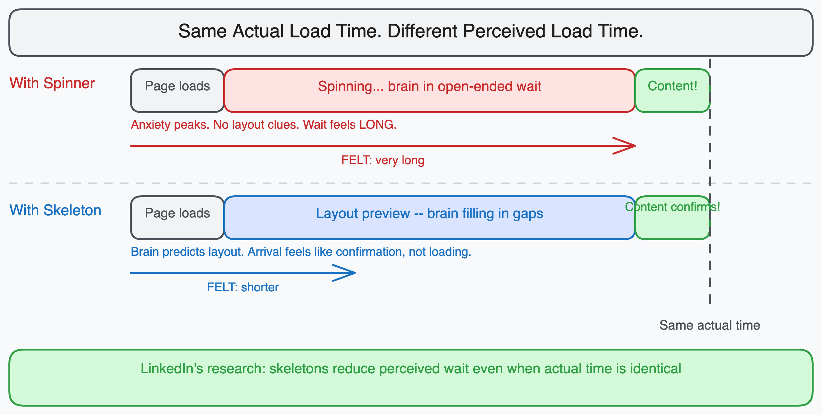
The finding: users perceived pages with skeleton screens as loading faster than identical pages with spinners, even when measured load time was exactly the same.
The explanation comes from cognitive psychology. A spinner communicates “something is happening, wait.” It gives no information about what is coming. The brain is in an open-ended wait state, which feels longer than a wait with a defined endpoint.
A skeleton screen communicates structure. The brain sees a page layout without content and begins filling in predictions about what will appear. By the time the content arrives, the brain has already partially processed the layout. The content arrival feels more like “confirmation” than “loading complete.” The subjective experience of waiting is compressed.
This is the same principle that makes progress bars feel faster than indefinite spinners, and why seeing “2 minutes remaining” on a file download feels better than “calculating…” even though knowing the duration does not change it.
What the brain actually does during a skeleton screen
When users see a skeleton screen, they are not passively waiting. They are pattern-matching.
The brain’s visual system recognizes layout shapes before it recognizes content. When you see gray rectangles in the shape of a card with a title area and a thumbnail placeholder, you already know you are looking at a list of articles or products. Your attention moves to where the interesting content will appear. When the content loads, your eye is already in position.
With a spinner, there is nothing to pattern-match against. No layout information has arrived. The entire page is an unknown. The user’s attention has nowhere to go.
The practical result: skeleton screens reduce the cognitive cost of waiting, even when they do not reduce the actual wait. The user feels more in control of the interaction, and perceived control reduces perceived wait time.
When spinners are correct
Skeleton screens are not always better. There are situations where a spinner is the right choice and a skeleton screen would be wrong or even counterproductive.
Short waits under 300ms. Skeleton screens require the user to notice the skeleton, process it, and then see it replaced by content. For operations that complete very quickly, this flicker of skeleton-then-content is more disruptive than a brief spinner, or nothing at all. The general rule is that anything under 300ms should show no loading state, anything between 300ms and 1 second can use a skeleton, and only operations that reliably take more than 1 second benefit clearly from the skeleton pattern.
Unpredictable content shapes. Skeleton screens only work when you know roughly what the loaded content will look like. If the content shape depends on the data (for example, a query that might return a single result or a table of 50 results), you cannot sketch a meaningful skeleton. A generic gray rectangle that looks nothing like the eventual content provides no layout preview benefit.
Actions with binary outcomes. For a form submission that either succeeds or shows an error, a skeleton screen is misleading. The user does not want a preview of the success state while waiting for confirmation that the action worked. A spinner correctly communicates “outcome is pending.”
Destructive or confirmation operations. “Deleting…” should show a spinner. Showing a skeleton of the content-less state while a delete processes would be confusing.
The three-tier timing model
A practical framework for choosing loading states based on expected wait time:
| Wait time | Pattern | Reason |
|---|---|---|
| Under 100ms | Nothing | Response feels instant, loading state adds flicker |
| 100ms to 300ms | Optional subtle fade | May be perceived as lag; brief indicator acceptable |
| 300ms to 1000ms | Skeleton screen | Long enough to notice; layout preview reduces anxiety |
| Over 1000ms | Skeleton screen with progress hint | User needs reassurance that something is happening |
| Indeterminate long wait | Progress bar or spinner with status text | When skeleton does not map to the content shape |
The key insight is that loading states are not about communicating “loading.” They are about managing user anxiety during a gap. Skeleton screens manage anxiety by filling the gap with useful information. Spinners manage anxiety by confirming that the system is working. Both are valid anxiety-management tools, just for different scenarios.
A CSS-only skeleton implementation
Skeleton screens do not require a library. A pulsing animation with CSS is sufficient for most use cases.
/* Base skeleton styles */
.skeleton {
  background-color: #e2e8f0;
  border-radius: 4px;
  position: relative;
  overflow: hidden;
}

/* The shimmer animation */
.skeleton::after {
  content: '';
  position: absolute;
  top: 0;
  left: 0;
  right: 0;
  bottom: 0;
  background: linear-gradient(
    90deg,
    transparent 0%,
    rgba(255, 255, 255, 0.4) 50%,
    transparent 100%
  );
  animation: shimmer 1.5s ease-in-out infinite;
  transform: translateX(-100%);
}

@keyframes shimmer {
  to {
    transform: translateX(100%);
  }
}
<!-- Article card skeleton -->
<div class="skeleton-card">
  <div class="skeleton" style="width: 100%; height: 200px; margin-bottom: 12px;"></div>
  <div class="skeleton" style="width: 80%; height: 20px; margin-bottom: 8px;"></div>
  <div class="skeleton" style="width: 60%; height: 16px; margin-bottom: 8px;"></div>
  <div class="skeleton" style="width: 40%; height: 14px;"></div>
</div>
The shimmer effect (the light that sweeps across the skeleton) serves a purpose beyond aesthetics. It signals motion, which confirms to the user that the page is alive and loading. A static gray block with no animation is harder to distinguish from a broken or empty state.
Skeleton screens in React
In a React application, skeleton screens are typically implemented as separate components that match the shape of the loaded content.
// The loaded state
function ArticleCard({ article }) {
  return (
    <div className="card">
      <img src={article.thumbnail} alt={article.title} />
      <h2>{article.title}</h2>
      <p>{article.excerpt}</p>
      <span>{article.readingTime} min read</span>
    </div>
  );
}

// The skeleton state -- same layout structure, no real content
function ArticleCardSkeleton() {
  return (
    <div className="card">
      <div className="skeleton" style={{ width: '100%', height: '200px' }} />
      <div className="skeleton" style={{ width: '80%', height: '24px', marginTop: '12px' }} />
      <div className="skeleton" style={{ width: '100%', height: '16px', marginTop: '8px' }} />
      <div className="skeleton" style={{ width: '40%', height: '14px', marginTop: '8px' }} />
    </div>
  );
}

// The parent component that chooses which to render
function ArticleFeed() {
  const { data, isLoading } = useArticles();

  return (
    <div className="feed">
      {isLoading
        ? Array.from({ length: 3 }).map((_, i) => <ArticleCardSkeleton key={i} />)
        : data.map(article => <ArticleCard key={article.id} article={article} />)
      }
    </div>
  );
}
The skeleton component mirrors the layout structure of the real component. The closer the skeleton matches the eventual content shape, the stronger the cognitive priming effect. A skeleton that looks nothing like the content (generic gray blocks with wrong proportions) provides little benefit over a spinner.
The mistake that makes skeletons worse than spinners
The biggest failure mode for skeleton screens is showing them when the data loads fast enough that the skeleton is visible for under 200ms. The sequence becomes: blank page, skeleton flash, content. That flash is worse than a spinner because it represents unnecessary visual complexity.
The fix is a minimum display time or a delayed render:
function ArticleFeed() {
  const { data, isLoading } = useArticles();
  const [showSkeleton, setShowSkeleton] = useState(false);

  useEffect(() => {
    if (isLoading) {
      // Only show skeleton if loading takes more than 300ms
      const timer = setTimeout(() => setShowSkeleton(true), 300);
      return () => clearTimeout(timer);
    } else {
      setShowSkeleton(false);
    }
  }, [isLoading]);

  if (isLoading && !showSkeleton) return null;
  if (isLoading && showSkeleton) return <ArticleCardSkeleton />;
  return data.map(article => <ArticleCard key={article.id} article={article} />);
}
With this approach, fast data loads (under 300ms) show nothing and content appears cleanly. Slow loads show the skeleton after the threshold. Users never see the flash.
Perceived performance is real performance
Lighthouse scores and Core Web Vitals measure objective timing. They matter and correlate with user satisfaction at scale. But the experience of waiting is subjective, and subjective experience is what determines whether a user comes back.
A page with a 2 second LCP and a well-implemented skeleton can feel faster than a page with a 1.5 second LCP and a spinner, if the skeleton communicates layout structure clearly and the content arrival matches the preview. That gap between measured and perceived performance is where skeleton screens operate.
LinkedIn bet their mobile redesign on this insight. The research held up. The pattern has been standard practice at every major product company since.