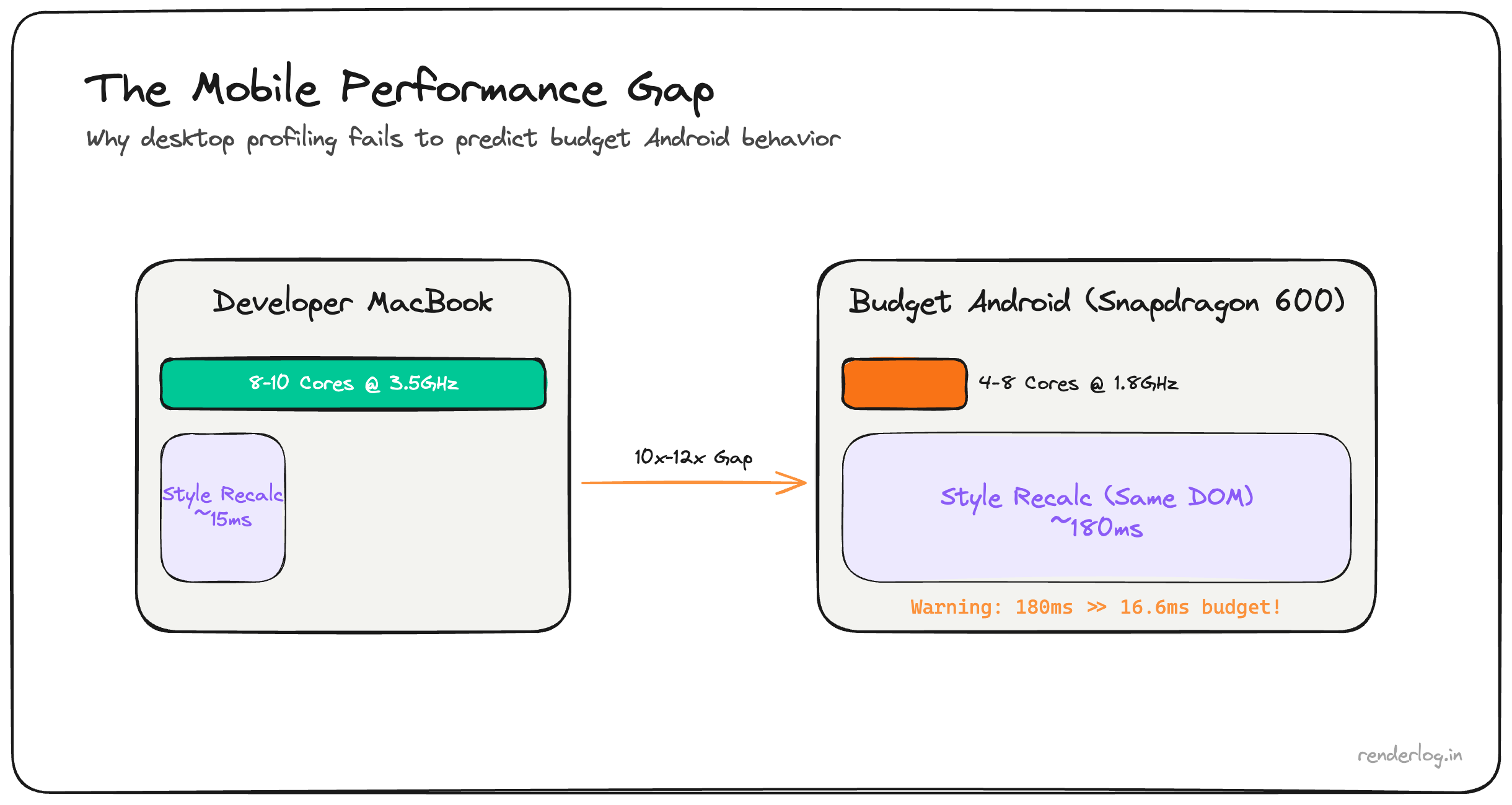
Style recalculation on a page with 10,000 DOM nodes takes ~180ms on a budget Android — 10x the entire 16.6ms frame budget. The exact same scroll that is imperceptible on a developer MacBook drops 90% of frames on a Redmi Note 9 or Samsung A-series device.
Why desktop profiling is misleading: The V8 engine on a budget Android runs at 5–10x lower throughput than on a developer laptop. Chrome’s 6x CPU throttle preset is still optimistic for real low-end hardware. The only reliable signal is remote debugging on physical budget devices.
What this covers: DOM size and style recalculation benchmarks on real hardware, content-visibility: auto, CSS contain, passive touch event listeners, IntersectionObserver vs scroll events, and the full mobile debugging workflow.
The mobile hardware reality
Before getting into fixes, it’s worth internalizing exactly why budget phones are so much slower not as an abstraction, but as a design constraint.
A typical mid-range Android in 2026 (Redmi Note series, Samsung A-series, Motorola G-series) has:
- 2–4 CPU cores running at 1.5–2.0 GHz, compared to your MacBook’s 8–10 cores at 3–4 GHz
- 3–4GB RAM (often shared with the OS, background apps, and the GPU)), with aggressive memory pressure killing background tabs
- No separate GPU memory the integrated GPU (shares RAM bandwidth with the CPU
- Thermal throttling: after 2–3 minutes of heavy load, the chip throttles to 60–70% of its peak frequency to avoid overheating
- A **V8 JavaScript engine: that’s the same version as desktop but running on a fraction of the hardware
The V8 engine on a budget Android is typically 5–10x slower at JS execution than on a developer laptop. Not because the software is different it’s the same engine but because the hardware is so much weaker. The JIT compiler has less time budget, inline caches fill differently, and garbage collection pauses are longer in relative terms.
The consequence: performance profiling on your development machine is actively misleading. You will mark tasks as “fast” that are catastrophically slow on real user hardware.
Chrome DevTools CPU throttling isn’t enough
Chrome’s “6x slowdown” CPU throttle in DevTools is a software throttle: it introduces artificial delays in the main thread scheduling. It doesn’t simulate reduced memory bandwidth, it doesn’t simulate thermal throttling, and it doesn’t simulate the actual V8 JIT behavior on ARM hardware with constrained memory.
It’s better than nothing. But I’ve found that even the 6x throttle is optimistic compared to a Redmi Note 9 or a Realme 8. Real users are often on hardware that would show up as 8–12x slower in practice.
The only reliable signal is remote debugging on real hardware.
# On Android: enable Developer Options, enable USB Debugging
# On your laptop:
chrome://inspect/#devices
Connect your phone, open the app in Chrome on the phone, and it shows up in chrome://inspect. You get the full DevTools Performance panel Timeline, flame charts, frame rate running against the real hardware. I’ve started keeping a Redmi Note 9 on my desk specifically for this.
DOM size and style recalculation cost
Here’s the fundamental problem with large DOM trees that most developers don’t feel until they test on mobile: CSS selector matching is O(n) per element per style recalculation, and it scales badly.
When you invalidate styles on a node (by adding a class, changing a property, or causing a reflow), the browser must re-run selector matching for potentially large subtrees. Selectors are matched right-to-left the browser finds all elements that match the rightmost part of the selector, then walks up the tree checking each parent. A selector like .sidebar .nav-item a:hover can be surprisingly expensive if .sidebar contains hundreds of elements.
Chrome’s DevTools calls this “Recalculate Style” in the Performance panel. When you see it taking 50ms+ on a frame, you have a DOM size / selector complexity problem.
Some real numbers from my testing (Redmi Note 9, Chrome 122):
| DOM node count | Recalc Style time (class toggle) |
|---|---|
| 500 nodes | ~4ms |
| 1,500 nodes | ~14ms |
| 3,000 nodes | ~35ms |
| 6,000 nodes | ~90ms |
| 10,000 nodes | ~180ms |
At 10,000 nodes, a single class toggle on a parent element costs 180ms 10x the entire 16.6ms frame budget. This is directly why our user’s phone was “unusable.”
The fix is straightforward in principle: fewer nodes. In practice, this means:
- Virtualizing long lists (only render what’s in the viewport)
- Not using deep nesting for layout purposes that could be flattened
- Avoiding
display: nonecontainers that still exist in the DOM they still participate in style matching - Auditing third-party components that inject dozens of wrapper divs for no structural reason
Mounting discipline: deferring below-fold components
One of the highest-leverage changes on the scroll path is deferring the mounting of below-fold components. If a component isn’t visible when the page loads, you don’t need it in the DOM immediately.
The naive approach is requestIdleCallback:
// Don't mount everything at once
function BelowFoldSection() {
  const [mounted, setMounted] = useState(false);

  useEffect(() => {
    const id = requestIdleCallback(() => setMounted(true), { timeout: 3000 });
    return () => cancelIdleCallback(id);
  }, []);

  if (!mounted) return <div style={{ minHeight: '400px' }} />;
  return <HeavyComponent />;
}
The better approach for scroll-triggered content is IntersectionObserver:
function LazySection({ children, placeholder }) {
  const [visible, setVisible] = useState(false);
  const ref = useRef(null);

  useEffect(() => {
    const observer = new IntersectionObserver(
      ([entry]) => { if (entry.isIntersecting) setVisible(true); },
      { rootMargin: '200px' } // Start loading 200px before it enters viewport
    );
    if (ref.current) observer.observe(ref.current);
    return () => observer.disconnect();
  }, []);

  return <div ref={ref}>{visible ? children : placeholder}</div>;
}
The 200px rootMargin gives you a buffer: components start mounting before the user scrolls to them, so there’s no visible loading flash. Measure the actual mount cost of each section in the Performance panel before deciding which ones to defer.
content-visibility: auto
CSS content-visibility: auto is a one-liner that tells the browser to skip layout and paint for off-screen content entirely. It’s essentially the CSS-native version of the above IntersectionObserver pattern, but implemented at the rendering engine level rather than in JavaScript.
.article-section {
  content-visibility: auto;
  contain-intrinsic-size: 0 500px; /* Hint for placeholder height */
}
When an element with content-visibility: auto is off-screen, the browser skips its layout and paint entirely. It doesn’t remove it from the DOM (the content is still there and accessible), but the browser treats it as if it has visibility: hidden for rendering purposes. When it scrolls into view: the browser renders it on demand.
The contain-intrinsic-size property gives the browser a fallback size to use for layout calculations while the content isn’t rendered. Without it, the element collapses to 0 height, which makes scrollbar sizing wrong and can cause layout jumps as content renders.
The limitation: if your sections have genuinely variable heights and you don’t know them ahead of time, contain-intrinsic-size requires estimation. Google shipped a auto keyword (contain-intrinsic-size: auto 500px) that remembers the last rendered size, which handles this in most cases.
The performance improvement is real. The Chrome team’s case study showed 7x rendering improvement on a long article page. On mobile hardware with 3,000+ nodes in a long-form page, this is one of the highest-ROI CSS changes you can make.
CSS contain property
content-visibility uses CSS containment under the hood. Understanding containment directly gives you finer-grained control.
.card {
  contain: layout style paint;
}
The contain property tells the browser that changes inside this element cannot affect anything outside it. There are four containment types:
| Containment | What it does |
|---|---|
layout | Layout inside this element cannot affect outside layout. Enables layout isolation. |
style | CSS counters and quotes are scoped to this element. |
paint | Content outside this element’s bounds is not painted. Enables paint isolation. |
size | The element’s size is independent of its children. Required for intrinsic-size guarantees. |
The practical value of contain: layout paint on card components is that a re-layout inside one card doesn’t trigger a full page reflow. On mobile, where reflows are expensive, this is meaningful.
`contain: strict: is shorthand for all four types use it for truly isolated widgets like ads, embeds, or sidebar components that have fixed sizes and no cross-document layout relationships.
Touch scroll performance
iOS has a history with scrolling that explains several CSS properties you’ll see in older codebases:
/* This was required in iOS <13 for momentum scrolling */
.scroll-container {
  overflow: scroll;
  -webkit-overflow-scrolling: touch; /* Deprecated but still seen */
}
-webkit-overflow-scrolling: touch was originally required on iOS to get the native momentum scroll behavior inside overflow containers. It’s been deprecated since iOS 13 (the browser now handles it automatically), but it still appears in codebases. You can safely remove it today.
What still matters is passive event listeners for touch handlers:
// BAD: blocks scroll until handler returns
element.addEventListener('touchstart', handler);

// GOOD: tells browser the handler won't call preventDefault()
element.addEventListener('touchstart', handler, { passive: true });
When a touch event listener is registered without { passive: true }, the browser must wait for your handler to return before it can scroll because your handler might call e.preventDefault() to cancel the scroll. This waiting introduces scroll jank. With { passive: true }, the browser knows it can start scrolling immediately without waiting.
Chrome DevTools will warn you about non-passive scroll listeners in the console:
[Violation] Added non-passive event listener to a scroll-blocking event
This is one of the easiest performance wins on mobile: just add { passive: true } to every touchstart, touchmove, and wheel listener that doesn’t need to block the scroll.
Scroll jank: the full picture
Scroll jank sources ranked by how often I see them in real apps:
| Source | Cause | Fix |
|---|---|---|
| Non-passive listeners | Browser waits for JS before scrolling | { passive: true } |
| Layout reads during scroll | getBoundingClientRect() / offsetTop in scroll handler | Batch reads, use IntersectionObserver |
| Heavy onscroll handlers | DOM manipulation, state updates every pixel | Throttle with requestAnimationFrame |
| Large DOM | Style recalc dominates frame time | Virtualize lists, reduce node count |
| Compositor-layer overflow | Too many will-change / transform: translateZ(0) | Audit GPU memory usage |
The requestAnimationFrame pattern for scroll handlers is worth knowing:
let lastScroll = 0;
let ticking = false;

window.addEventListener('scroll', () => {
  lastScroll = window.scrollY;

  if (!ticking) {
    requestAnimationFrame(() => {
      updateUI(lastScroll);
      ticking = false;
    });
    ticking = true;
  }
}, { passive: true });
This ensures your scroll handler runs at most once per frame, aligned with the browser’s render schedule, rather than potentially dozens of times between frames.
IntersectionObserver vs scroll events
IntersectionObserver is off the main thread. The browser handles the intersection calculations in a separate process and delivers callbacks to your JavaScript only when intersection ratios change. This means it doesn’t fire dozens of times per scroll only when something actually enters or exits the viewport.
const observer = new IntersectionObserver((entries) => {
  entries.forEach(entry => {
    // This callback is batched and off-main-thread for intersection math
    entry.target.classList.toggle('visible', entry.isIntersecting);
  });
}, { threshold: 0.1 });

document.querySelectorAll('.animate-on-scroll').forEach(el => observer.observe(el));
Compare this to the scroll event approach that was common five years ago:
// Don't do this on mobile
window.addEventListener('scroll', () => {
  document.querySelectorAll('.animate-on-scroll').forEach(el => {
    const rect = el.getBoundingClientRect(); // Forces layout!
    if (rect.top < window.innerHeight) {
      el.classList.add('visible');
    }
  });
});
The scroll version runs on the main thread, calls getBoundingClientRect() on every element (which forces a layout flush), and executes potentially hundreds of times per second. On a Redmi Note 9, this will stutter.
Input latency: the 300ms tap delay
Until around 2017, mobile browsers introduced a 300ms delay before firing click events from taps. The reason: the browser needed to wait to see if the tap was the first tap of a double-tap zoom gesture. This is now mostly resolved, but the fix is worth knowing:
/* Eliminates 300ms tap delay on elements */
.button {
  touch-action: manipulation;
}
touch-action: manipulation tells the browser this element supports tap and pan but not double-tap-to-zoom, so the 300ms wait isn’t needed. Modern browsers (Chrome 55+, Safari 13+) have removed the delay globally for pages with a <meta name="viewport" content="width=device-width"> tag, but touch-action: manipulation is belt-and-suspenders for interactive elements on older devices.
Images on mobile
Image rendering is a surprising source of main thread cost on mobile:
<!-- The full mobile image treatment -->
<img
  src="/images/hero-800.jpg"
  srcset="/images/hero-400.jpg 400w, /images/hero-800.jpg 800w, /images/hero-1200.jpg 1200w"
  sizes="(max-width: 600px) 100vw, (max-width: 900px) 50vw, 800px"
  loading="lazy"
  decoding="async"
  width="800"
  height="533"
  alt="..."
/>
The three attributes that matter for mobile performance:
loading="lazy": defers fetching images outside the viewport. On a page with 20 images, this can save 5–10MB of initial load on mobile.decoding="async": tells the browser to decode the image off the main thread. Without this, large image decodes happen synchronously and can spike frame times.sizes: tells the browser which image to download based on the viewport width. Without accuratesizes, the browser guesses wrong and often downloads the full-size image on a phone.
Always specify explicit width and height on images. Without them, the browser can’t reserve space for the image before it loads, causing Cumulative Layout Shift which is even more jarring on mobile where reflows are slower.
Putting it together
The mobile performance debugging workflow I follow now:
- Profile on real hardware don’t trust desktop throttle
- Check DOM node count anything over 1,500 nodes in the initial render deserves scrutiny
- Add
content-visibility: autoto long-page sections - Add
{ passive: true }to all scroll/touch listeners - Replace scroll listeners with IntersectionObserver where possible
- Check for
getBoundingClientRect()in scroll handlers (it forces layout) - Virtualize any list over 100 items use
react-virtuosoor@tanstack/virtual - Set explicit image dimensions and add
loading="lazy"+decoding="async"
Budget mobile devices are not edge cases: they’re often the majority of your users’ hardware outside of North America and Western Europe. Building with that constraint in mind from the start is dramatically cheaper than retrofitting it after your analytics start showing high bounce rates on Android.