Related: Images, Fonts, and Third-Party Scripts: LCP and CLS Killers covers the full image performance picture including format selection and preloading strategies.
If you have ever added loading="lazy" to an image tag without knowing exactly what it does, you are not alone. Most developers copy it from tutorials and move on. But there is a specific reason Google added it to the HTML spec, there is a specific mechanism that makes it work, and there are two situations where using it will actively hurt your performance scores instead of helping them.
What this covers: Where the browser’s default image loading behavior falls short, what Google found in their 2019 profiling study, how the browser calculates when to start fetching a lazy image, and the two cases where loading="lazy" should never appear.
Why this attribute exists at all
Before loading="lazy" was part of the HTML spec, developers who wanted to defer offscreen image loads had to write JavaScript. The standard approach was to use IntersectionObserver, set the real src on a data attribute, and swap it in when the image entered the viewport.
// The JavaScript-based lazy loading pattern from before 2019
const images = document.querySelectorAll('img[data-src]');

const observer = new IntersectionObserver((entries) => {
  entries.forEach(entry => {
    if (entry.isIntersecting) {
      const img = entry.target;
      img.src = img.dataset.src;
      observer.unobserve(img);
    }
  });
});

images.forEach(img => observer.observe(img));
This pattern worked, but it had a problem: the JavaScript had to be downloaded and executed before any images could be lazily loaded. If the script was render-blocking or deferred, you had a window where images loaded eagerly anyway. If the user had JavaScript disabled, every image loaded immediately regardless.
Google’s Chrome team looked at how images were actually being loaded across the web. Their profiling found that images below the fold were responsible for 30 to 50 percent of initial bandwidth on median web pages. These are images the user may never see, especially on long pages where the majority of visitors never scroll past the first two screens.
They proposed a native solution: a browser-level attribute that requires no JavaScript, loads before any scripts run, and degrades gracefully when JavaScript is unavailable. The W3C standardized it, and Chrome shipped it in version 77 in September 2019. Firefox followed in version 75. Safari added it in 15.4.
How the browser decides when to fetch a lazy image
When you add loading="lazy" to an image, the browser does not simply wait until the image is in the viewport to start fetching it. It uses a distance-from-viewport threshold that varies based on the connection speed.
On a fast connection, Chrome starts fetching a lazy image when it is within 1250px of the viewport. On a slow connection (2G, slow-3G), that threshold drops to 2500px. The idea is that on a slow connection, the browser needs more lead time to fetch the image before the user scrolls to it.
This is why lazy loading does not cause a visible flash or delay on most scroll interactions. By the time most users scroll down, the browser has already started fetching the image that is about to appear.
<!-- This image starts loading when it is ~1250px below the viewport -->
<img
  src="/blog/thumbnail.webp"
  alt="Article thumbnail"
  width="400"
  height="225"
  loading="lazy"
/>
The threshold is implemented inside the browser’s network stack, not in JavaScript. That means it runs before any of your application code, and it runs even when JavaScript is completely disabled.
What the browser does with the saved bandwidth
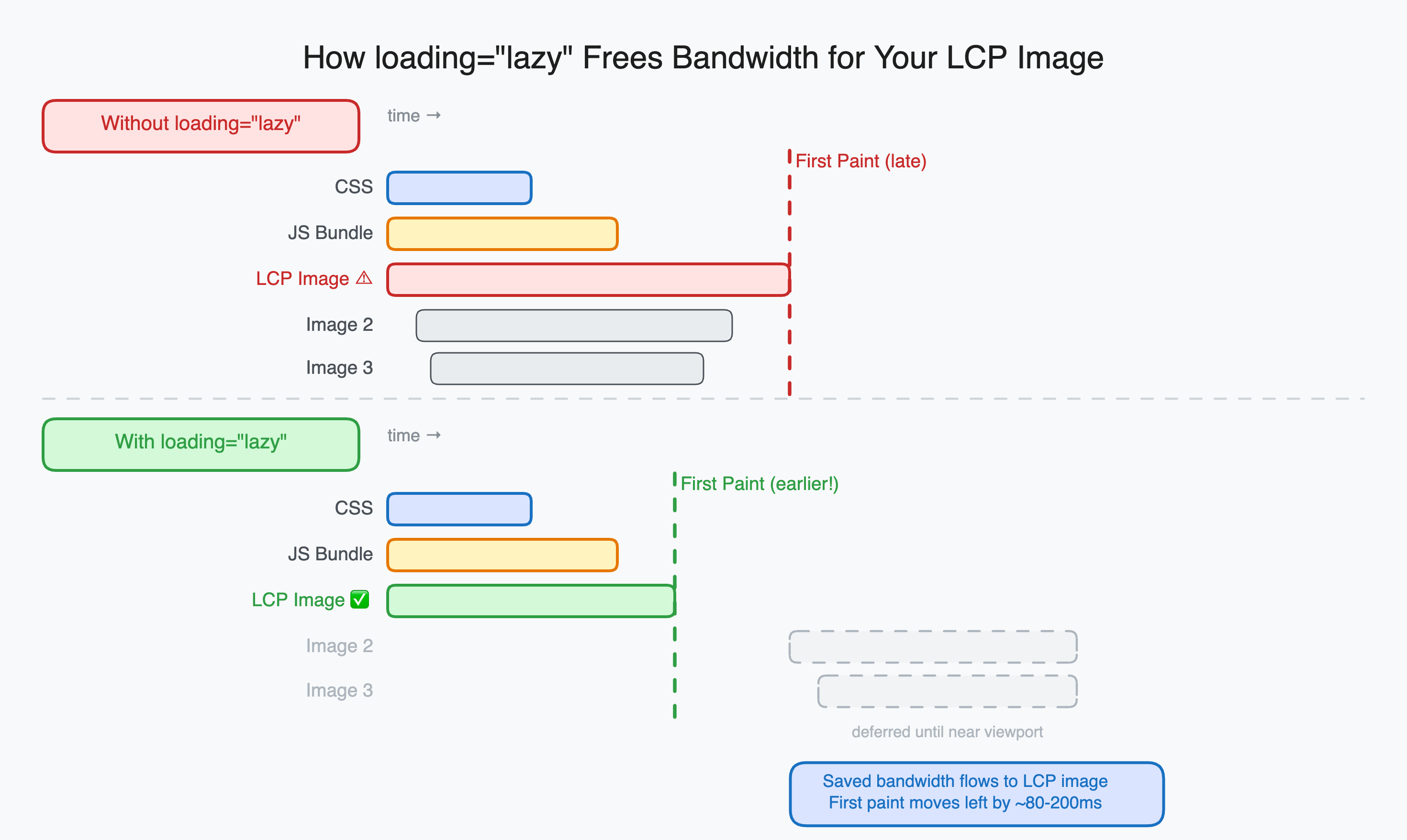
The bandwidth saved from not loading below-fold images is not wasted. The browser reallocates it to higher-priority resources: your CSS, your fonts, your LCP image, and your JavaScript. On pages with many images, the cascade effect is significant.
A page with 12 images where only 3 are above the fold saves 9 image fetches from the initial network queue. Those freed connections let critical resources load faster. First Contentful Paint improves. LCP improves. Time to Interactive improves.
The exact gains depend on the page and the connection, but Google’s own measurements showed that adding loading="lazy" to below-fold images on the Chrome developer documentation site reduced the total bytes downloaded on the initial load by around 40 percent.
The two situations where you should never use it
The LCP image. The Largest Contentful Paint element is usually the hero image or the first content image on the page. If you add loading="lazy" to it, the browser will defer fetching it until it calculates that the image is close to the viewport, which happens after layout is complete, which is after CSS is parsed, which can be several hundred milliseconds into the page load.
On a fast connection with a small HTML document, this barely matters. On a slow connection or a page with a large HTML document, this difference can push LCP from 2 seconds to 5 seconds.
<!-- Never do this for your LCP image -->
<img
  src="/hero.webp"
  alt="Hero"
  loading="lazy"
/>

<!-- Do this instead -->
<img
  src="/hero.webp"
  alt="Hero"
  loading="eager"
  fetchpriority="high"
  width="1200"
  height="630"
/>
Images in the first screenful without a known position. If an image is placed early in the HTML but its final position depends on CSS that has not loaded yet, the browser cannot calculate whether it is in the viewport. It may incorrectly defer the fetch. If the image turns out to be above the fold once layout completes, you will see a visible pop-in.
The fix in both cases is loading="eager", which is the browser’s default for images anyway. You are not doing anything special with it, you are just being explicit that this image should not be deferred.
The width and height attributes are required
When you defer an image load, the browser does not know the image dimensions until it fetches the image. If it does not know the dimensions, it renders the image as 0x0 and then expands it when the image loads. That expansion shifts the content below it, causing Cumulative Layout Shift.
The fix is straightforward: always include width and height on every image, lazy or not.
<img
  src="/article/diagram.png"
  alt="Diagram showing the rendering pipeline"
  width="800"
  height="450"
  loading="lazy"
/>
With explicit dimensions, the browser reserves the exact space for the image before it loads. When the image arrives, nothing shifts. This applies to all images, but it matters most for lazy-loaded ones because the fetch is deferred and the gap between “image slot appears” and “image arrives” is longer.
Browser support and the polyfill situation
Native loading="lazy" is supported in Chrome 77+, Firefox 75+, Edge 79+, and Safari 15.4+. That covers somewhere around 95 percent of global browser usage as of 2026.
For the remaining 5 percent (primarily older Safari versions and some legacy Android browsers), the browser simply ignores the attribute and loads images normally. This is the correct degraded behavior. The page still works, images still load, you just lose the performance benefit.
No polyfill is required for production use. The progressively enhanced behavior is exactly what you want.
If you specifically need to support very old browsers and want lazy loading there too, the lazysizes library implements the IntersectionObserver approach as a fallback. But for most applications, the native attribute is sufficient and simpler.
Quick reference
| Image position | loading attribute | fetchpriority |
|---|---|---|
| Hero / LCP image | eager | high |
| Above the fold, not LCP | eager | (omit) |
| Below the fold | lazy | (omit) |
| Deep in page (below 2 screens) | lazy | (omit) |
The rule is simple: anything the user sees without scrolling gets loading="eager". Everything else gets loading="lazy". The default browser behavior without the attribute is to load everything eagerly, which is why the attribute exists in the first place.
One attribute, no JavaScript, no library dependency, immediate performance improvement. The reason Google pushed it into the spec is that this pattern was so universally correct that it should not require developer effort to implement on every site individually.