Related: The Browser Main Thread and Rendering Pipeline explains the full rendering pipeline that critical CSS inlining is optimizing for.
Lighthouse flags “eliminate render-blocking resources” and most developers look at their CSS files with mild confusion. The file is small. It is on a CDN. How can 15KB of CSS be blocking the render of a page that otherwise looks fast? The answer is in the word “render-blocking” itself, which is more precise than it sounds. The browser will not draw a single pixel to the screen until it has read every CSS file in the document head. Not because it is slow, but because it is correct.
What this covers: Why all CSS is render-blocking by specification, what the browser is actually waiting for before painting, how critical CSS inlining removes the wait, and how to extract and inline it without manually editing stylesheets.
Why the browser blocks on CSS
The browser builds two trees before painting: the DOM (Document Object Model) from your HTML, and the CSSOM (CSS Object Model) from your CSS. Rendering requires both. The render tree is built by combining DOM and CSSOM, and nothing is painted until the render tree exists.
This means CSS is blocking by design. The browser cannot make progress on rendering while waiting for an external CSS file because it literally does not know how to style any element until all CSS is parsed. An element that appears red in the DOM might be styled to be invisible in CSS. The browser has no way to know until it reads the CSS.
When the browser encounters a <link rel="stylesheet"> tag in the HTML, it:
- Pauses HTML parsing to prioritize fetching the CSS file (CSS is a high-priority resource)
- Starts a network request for the CSS file
- Waits for the full file to download
- Parses the CSS and builds the CSSOM
- Resumes HTML parsing
- Proceeds to build the render tree and paint
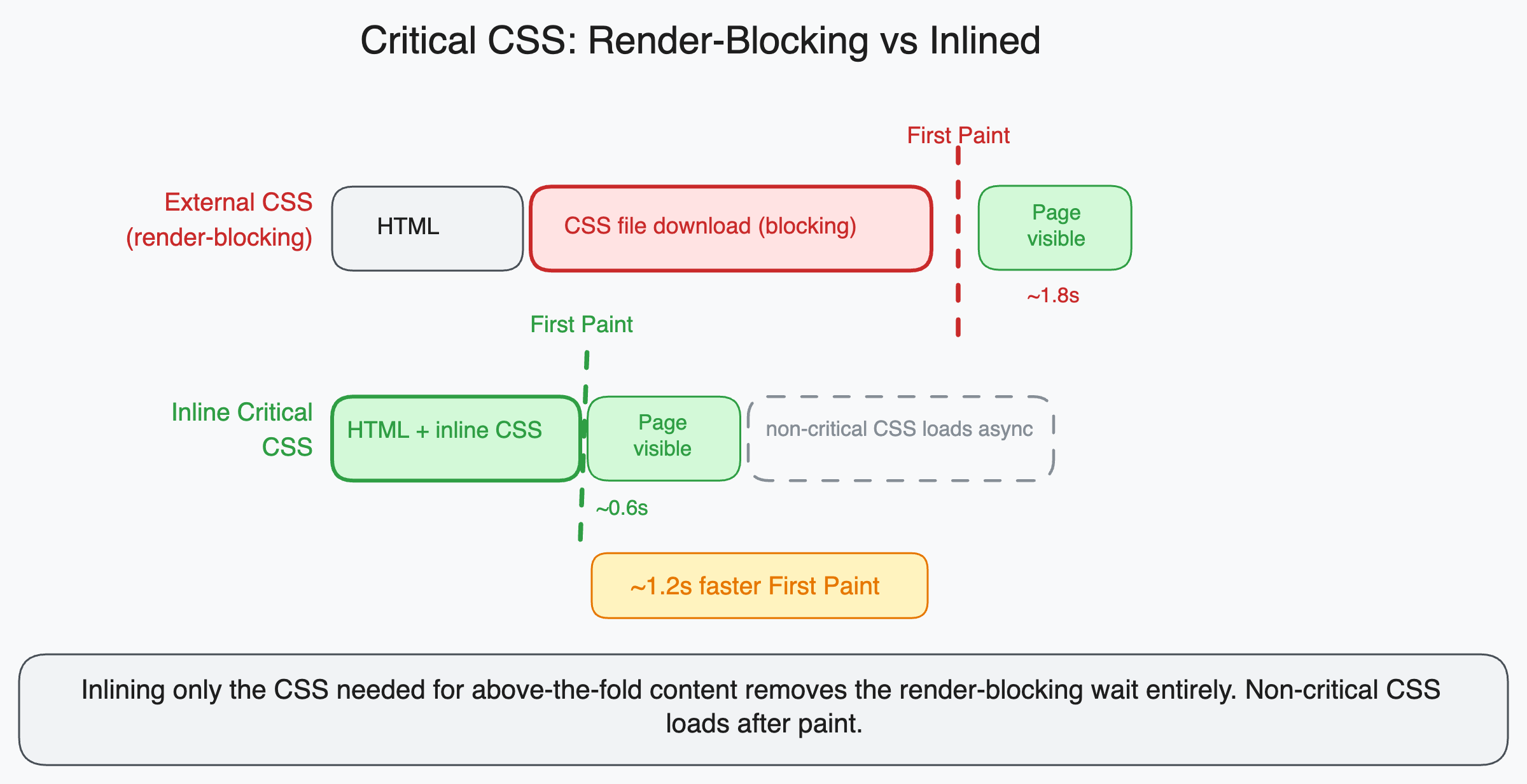
That network request in step 2 is the problem. On a typical server with a 100ms round trip time, a CSS file adds at minimum 100ms to the time before the first pixel appears. With a slower connection or a server that is geographically distant, this can be 300 to 500ms. The CSS file can be completely empty and the delay still happens because the browser does not know that until it receives the empty file.
What critical CSS is
Not all CSS needs to block the render. The CSS needed to render the visible content on the initial viewport (above the fold) blocks the render of something the user cares about. The CSS for a modal that appears three screens down, the CSS for the footer, the CSS for components the user has not scrolled to yet: these block rendering but the user does not see the result of that rendering anyway.
Critical CSS is the subset of your CSS that applies to elements visible in the initial viewport without scrolling. It is the minimum CSS needed to make the above-the-fold content look correct.
For a typical landing page, critical CSS might include:
- Body and base typographic styles
- Navigation bar styles
- Hero section layout and colors
- Above-fold image styles
- Any font-face declarations for above-fold text
Everything else is non-critical: sidebar styles, footer, modal, article content styles, form styles for components below the fold.
How inlining fixes the problem
Instead of loading critical CSS from an external file, you embed it directly in the HTML document inside a <style> tag in the <head>.
<!DOCTYPE html>
<html>
<head>
  <!-- Critical CSS: embedded directly, no network request needed -->
  <style>
    body { margin: 0; font-family: system-ui, sans-serif; }
    .nav { height: 60px; background: #fff; border-bottom: 1px solid #eee; }
    .nav__logo { font-size: 1.25rem; font-weight: 600; }
    .hero { padding: 80px 24px; max-width: 800px; margin: 0 auto; }
    .hero__title { font-size: 2.5rem; line-height: 1.2; }
    /* ... rest of above-fold CSS ... */
  </style>

  <!-- Non-critical CSS: loaded asynchronously, does not block paint -->
  <link
    rel="preload"
    href="/styles/main.css"
    as="style"
    onload="this.onload=null;this.rel='stylesheet'"
  />
  <noscript><link rel="stylesheet" href="/styles/main.css" /></noscript>
</head>
The critical CSS is available immediately: the browser reads the HTML, finds the <style> tag, parses the CSS inline, and builds the CSSOM without a network round trip. It can begin rendering above-fold content immediately.
The full stylesheet loads asynchronously using the rel="preload" trick (preload the file with as="style", then switch rel to stylesheet when loaded). Below-fold content that depends on the full stylesheet renders when it loads, but by that time the above-fold content is already visible and the user has started reading.
The <noscript> fallback handles the case where JavaScript is disabled, which would prevent the onload from firing. In that scenario, the stylesheet loads normally as a blocking resource.
Why manually maintaining critical CSS is impractical
Manually identifying which CSS applies above the fold and which does not is not feasible at any scale. Layouts change. Viewports vary. The above-fold content on a 375px phone is different from the above-fold content on a 1440px monitor.
The standard approach is to automate extraction with a tool that renders the page in a headless browser, identifies all elements visible in the initial viewport, and extracts the CSS rules that apply to those elements.
Critters is a plugin for webpack and Vite that does this at build time:
// vite.config.ts
import { critters } from 'vite-plugin-critters';

export default {
  plugins: [critters()],
};
After building, Critters:
- Renders each HTML page in a headless environment
- Identifies which CSS rules apply to above-fold elements
- Inlines those rules in
<style>tags - Changes the
<link>to load asynchronously
No manual work required. The build output has correct inlined critical CSS for each page.
Next.js has had critical CSS extraction built in since v10 through its integration with Critters. If you are using Next.js, this optimization is applied automatically to pages using the App Router.
Critical is a standalone Node.js package for extraction:
import critical from 'critical';

await critical.generate({
  base: 'dist/',
  src: 'index.html',
  target: {
    html: 'index-critical.html',
    css: 'critical.css',
  },
  width: 1300,
  height: 900,
  // Also generate for mobile viewport
  dimensions: [
    { width: 375, height: 812 },
    { width: 1300, height: 900 },
  ],
});
The dimensions option is important: critical CSS should cover the most common viewport sizes, not just one. A rule that is critical on mobile (because it styles content visible at 375px width) might be non-critical on desktop (where the content is below the fold), and vice versa.
The tradeoffs to understand
HTML file size increases. Inlining critical CSS means the CSS is embedded in every HTML response rather than being fetched once and cached. For pages with substantial critical CSS (say, 20KB), this adds 20KB to every HTML response. Weigh this against the round-trip savings.
CSS is duplicated. Critical CSS rules appear both in the <style> tag and in the full external stylesheet. When the external stylesheet loads, the browser parses the same rules again. This is harmless (CSS parsing is fast) but worth knowing.
Dynamic content complicates extraction. If your page uses client-side rendering to insert above-fold content after the initial HTML load, the extraction tool cannot see that content. The critical CSS it extracts will be incomplete because the above-fold elements did not exist when the headless renderer checked.
For server-side rendered pages, extraction works accurately. For heavily client-side rendered pages, you may need to either use renderBefore options to delay extraction until after React hydrates, or limit critical CSS to truly static above-fold elements like the navigation.
The Lighthouse connection
When Lighthouse reports “Eliminate render-blocking resources” and lists CSS files, it is measuring the time between when the page starts loading and when the first paint occurs. Every external CSS file in <head> adds to this time.
After inlining critical CSS and loading the full stylesheet asynchronously, Lighthouse will no longer flag the CSS file as render-blocking because it is loaded asynchronously and does not delay the initial paint.
The metric that typically improves most is First Contentful Paint, because above-fold content can now paint as soon as the HTML is received rather than waiting for an external CSS round trip. Depending on the server response time and connection speed, the FCP improvement can range from 100ms on fast connections to over 500ms on slow mobile connections.
A mental model for understanding render-blocking
Think of the browser as a factory. The HTML is the blueprint, the CSS is the paint colors and finishes specification, and the factory cannot start production until it has both documents. If the paint colors arrive one minute late, the entire factory sits idle for one minute regardless of how fast the machines are.
Critical CSS inlining is equivalent to printing the paint colors for the first section of the product directly on the blueprint. The factory can start producing the visible parts immediately and wait for the full paint specification to arrive for the parts it will produce later.
The external stylesheet still arrives and the rest of the page still gets fully styled. But the user sees the first screenful of content without waiting for a network round trip that was never about content the user could see on arrival.